|
|
|
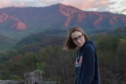
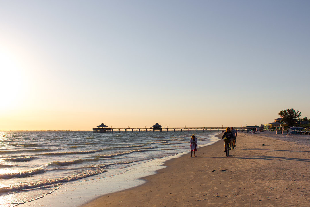
Creating an introductory website from scratch is an accomplishment (and I think everyone in class should given themselves some credit for knowing what a tag is and what CSS is for!). Overall I am proud of my individual website, specifically for its simplicity and intentionality. Let’s dive into my website building process, before, during, and after. Purpose I wanted to create a website with a purpose similar to my personal website, which I created with Wix, but from scratch. However, my personal website only displays photos, videos, and a blog, so I wanted this website to include other services I can provide Belmont students, specifically Belmont artists. Before Prior to this class, my experience with HTML and CSS was minimal, but I did have some experience. Because of that, I had an idea of the general, basic capabilities of what a beginner could design, and I envisioned my introductory website accordingly. I kept my vision simple design-wise, not only to stick to the basics of coding, but also to let my work (photographs, videos, etc.) speak for itself. Below is a sketch of my envisioned design: 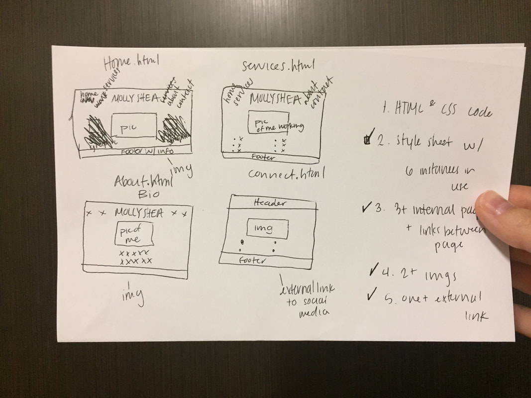 The Process Because I started working on my website before we did our HTML and CSS tutorial and tutorial exercises in class, I started my website completely from scratch. My design process was based on trial and error which I both love and hate. When I needed to figure out how to do something, I used Google, W3Schools, random websites, and random YouTube videos. A couple things I found most helpful and satisfying to create with the use of the Internet were the nav bar and the process of linking pages to one another. I think because I had already created a website from scratch before (via a children’s coding book) and envisioned a simple design for this site, I was able to carry out my vision well. However, if I had no coding experience, I would’ve been much more imaginative and inspired to create a website with all of the bells and whistles of a professional site. Another important part of my process was streamlining it. At first, I would change each little element of the site until I liked it, but then I realized it was better to create/design/format the home page to my liking, then copy/paste all of that code onto the other pages. This made my workflow much faster. All I had to do was change paragraph text, add unordered lists as needed, and change the file names of photos. This is a tip I would give to new HTML/CSS coders. If I knew all the CSS and HTML code in the world, I think my site would still be a similar layout to my site — simple, clean — but I would include rolling slideshows on my pages, among other little things that make the site look more professional, such as various hover features. After To analyze my final website, let’s examine the modes I used to communicate with viewers, specifically the linguistic, spatial, and visual modes. 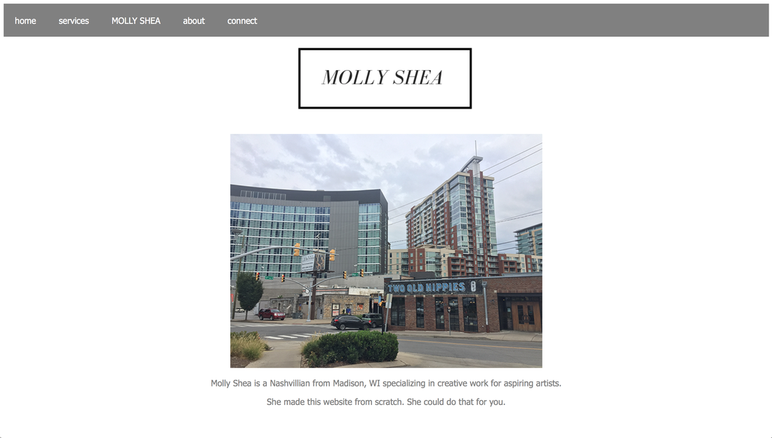 Linguistic — I think the tone of my website is professional yet still “me.” While I don’t use any “lol”s, I do use a lighter tone in my copy. My hope is that that language doesn’t come across as distracting or unprofessional but welcoming, casual, and personable. Also, I wouldn’t want to sound stiff, especially because my target audience is Belmont students. Spatial — The spatial mode is one of the most important modes of a website in my opinion. Clutter is an element that can overwhelm a viewer instantly, many times causing the viewer to leave the site. I know this from experience. Thus, in my website I paid special attention to space, the spatial mode, and proximity. I added a bit of extra space between paragraph lines and between my photos and words, giving readers a sense of breathing room in between modes and ideas. I can just imagine someone viewing my site and sighing happily… at least I hope that’s what you did… One affordance of my spatial work (and challenge of my technical work!) was that I really couldn’t figure out how to space out/center align my nav bar, and I think this may leave the observational viewer a bit disappointed. In addition to proximity, another design strategy that falls into the spatial mode category is alignment. Alignment is important for how elements are displayed on the page. I center aligned all images and text on my website for a straight forward look. I think it can be cool to mess around with alignment — it can be an unexpected place to get creative — but I didn’t want to detract from my images and text with out-of-the-ordinary alignment. Is my alignment too boring? What are your suggestions to improving this part of my site? 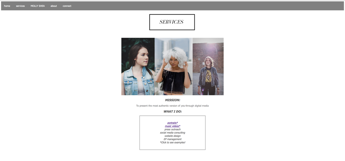 Visual — The visual mode is a mode that I wanted to capture in my website via my images. These are images that I took and I chose these to display my creativity and eye for framing, colors, etc., especially because one of my competencies/“services” is photography. The goal of including these photos was to sell the viewer on myself as a creative, and the goal of including very few photos was to keep the reader wanting more, perhaps directing them to my other website or to my Instagram to see more of my work. Whenever I become obsessed with a photographer, graphic designer, or creative in general, I always check their website but then move over to their Instagram (or vice versa) to see more.  Another part of the visual mode that I considered while designing was color. Personally I love monochrome, especially for websites, because it can be hard for non-designers to choose color schemes with a purpose. But I also think color is very important in catching a viewer’s eye, like we talked about in our analyses of Shakespeare archives. So, I decided to compromise and meet in the middle: my background color, nav bar, and text are all in monochrome colors, but I added my pops of color with the images I chose. Generally I would describe the colors I use in my photos as muted and soft but not desaturated. My hope is that the colors add warmth and invite viewers into the website’s pages, and ultimately persuade viewers to #hireme.
1 Comment
10/3/2018 02:10:02 pm
I'm looking forward to seeing your storyboard because of how relatable to subject matter is! Getting coffee at a boutique kind of coffee shop is a special kind of activity that most of us find ourselves doing quite often. Your organization of the scenes is very comprehensible, and your playing with the proximity will add some intrigue I think. I'm sure the lighting will be different depending on the day you go to film, and I'm excited to see how it turns out! Leave a Reply. |
|||
