|
|
|
|
Shakespeare on the Road and its website are a change-inducing phenomenon. It’s a compilation of archives of 14 different Shakespeare festivals that took place in the summer of 2014 (context). The team, a group of four Shakespeare fans who are professors, authors, and adventurers (author), traveled over 10,000 miles, mostly by road, in only two months to watch the productions and to interview actors. To archive their work, the team created this website to showcase the multimedia items, such as documentaries, podcasts, and case studies, that they created from their journey (purpose, genre). I believe that the team wanted to create the website for people who were a part of these 14 festivals, people who are interested in Shakespeare in the modern age, and for their colleagues, friends, and family to see all of the work they did in two months (audience). I think Shakespeare on the Road is awesome and that it would be a rewarding experience to tackle a project as big as theirs — Shakespeare related or not. 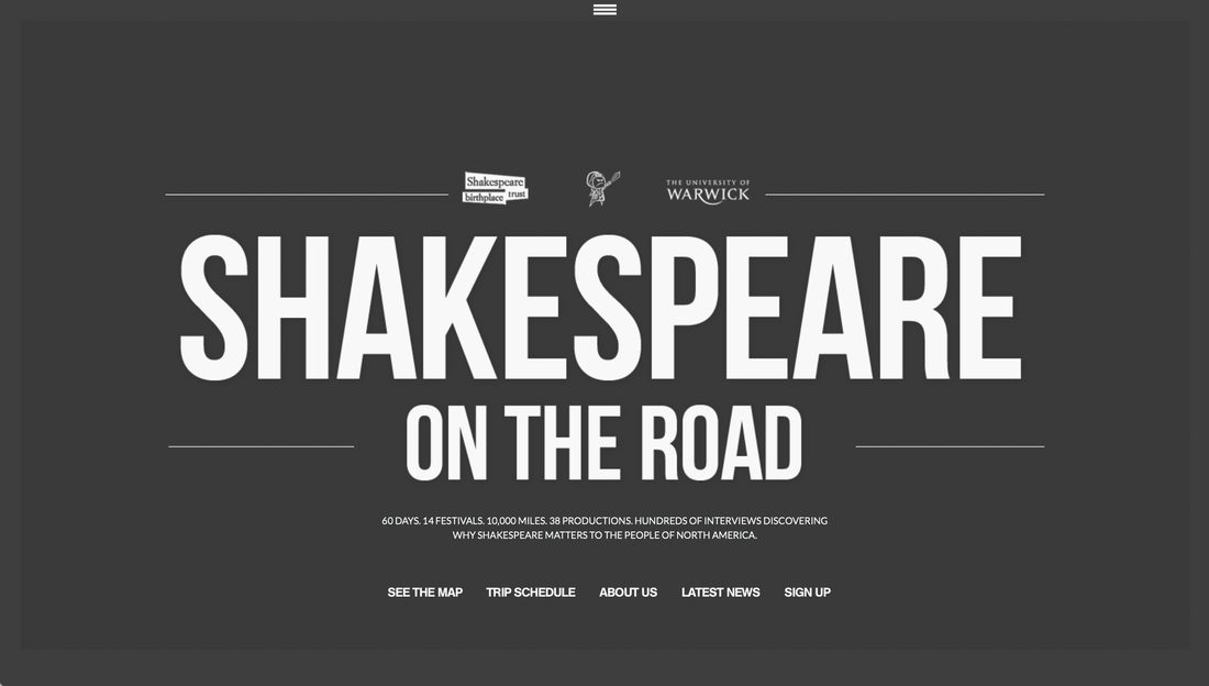 Now, let’s look at how the team executes the website itself. Is it easy to navigate? Inviting? Does it makes sense for its genre and the work it’s displaying? While I love Shakespeare on the Road itself, I feel the website needs some work. Starting from top to bottom, I’m not sure that the “Shakespeare on the Road” opening page works, partly because of the font choice (I would describe it as modern and basic, as in I’ve seen it everywhere), and partly because I think the opening page could benefit from a horizontal photo in the background. They were probably going for a bold and commanding look by putting emphasis on the words only, but that doesn’t fit with what the website is used for. 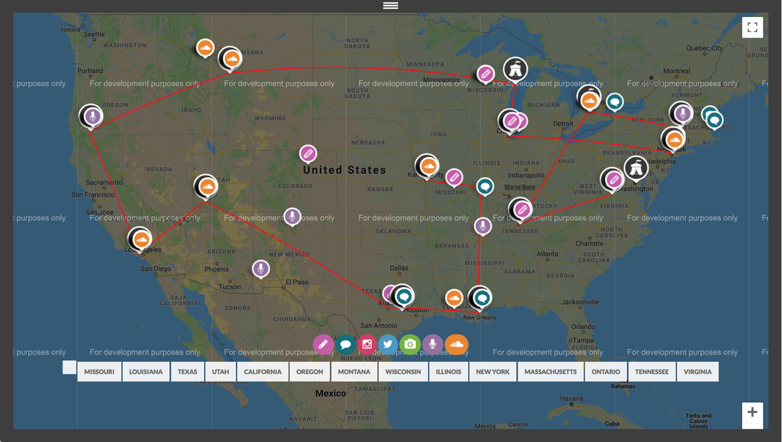 Next, I would argue that the map that immediately follows the opening page should not be what comes immediately after the website title. After just opening the website and seeing its title, I still don’t know what Shakespeare on the Road is — and maybe they can get away with not explaining what SOTR at the beginning because they assume their audience already knows, but I still think it’s worth putting the description directly after the opening. I think the map is cool, but there’s a lot of information on there that a website viewer is overloaded with, especially right after the four bold words on the front page. As you continue scrolling, you come to a grid that takes you to different parts of the website. Not to be a hater, but I don’t think this works either. (I tried to include a screenshot of this grid in this blog post, but I had a hard time with it because of their website.) It’s hard for me to understand the differences between the categories “Thought for the day” and “Notes from the road”, for example. The organization of the grid showcases how the team organized their content -- by each type of media (photos, podcasts, notes, interviews) instead of by festival...why?  Keep scrolling further and you’ll find yourself having trouble reading the font, but more specifically the proximity of the characters in the font, that they chose. You could say it looks clean but it’s not functional. In this font, they start chunking out parts of the websites in that weird font that no one can read. Plus, do you think anyone would click on these? Go scroll through the entire first page and let me know what you think about this in a comment! 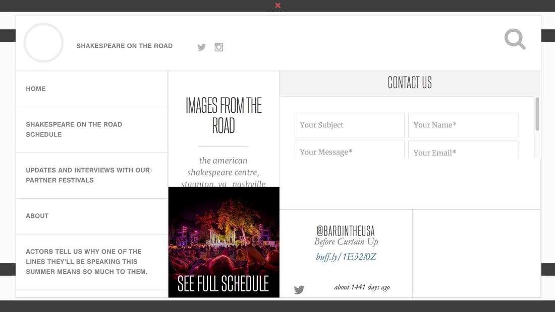 Finally, if you click the nav bar at the very top of the page, you will get confused and overloaded with the amount of rectangles and the volume of words used when really one or two would suffice. For example, while one of the categories is “About”, another one is entitled “Actors tell us why one of the lines they’ll be speaking this summer means so much to them” when, in my opinion, they could’ve shortened that to “Actor interviews.” After my analysis of Shakespeare on the Road’s rhetorical situation and its website design, I have learned things to do and things not to do when creating our Hamlet archive:
Dos:
4 Comments
9/16/2018 03:58:18 pm
Wow. This is incredibly thorough. I would be both delighted and scared if you were reviewing an archive I had created because you are very observant of the good as well as the bad. I appreciate someone who gives their all to any given assignment and it seems like you have definitely done that here! You have a unique perspective and a voice (written and verbal) that makes people want to listen! It's cool.
Molly Shea
9/18/2018 03:02:04 pm
Madeline <3
Jack Tucker
9/18/2018 10:47:43 am
This post is extremely well written! You did a great job at breaking down why this website was rhetorically effective and the pictures made everything you wrote about so easy for me as someone who has never even seen this website to understand. I'm glad that you were able to pull both "dos" and "don'ts" as well. I couldn't agree more with your point about keeping information (especially headers) concise. Well done!
Molly Shea
9/18/2018 03:02:45 pm
You are just delightful! Leave a Reply. |
